Does Uplighting Ruin Your Wedding Photos?
It’s the question I get from nearly every Birmingham couple who’s browsed a few horror stories online: do uplighting photos come out looking like a red-tinted crime scene? Short answer — no, not when it’s done right. The scary examples you’ve seen almost always come from cheap gear pointed the wrong way, not from uplighting itself. So let’s clear the air, bust the myth, and talk about how colored light actually plays with a camera so your reception photos glow instead of clash.
In this article
Where the “ruined photos” myth comes from
Let’s start with why this fear exists, because it didn’t come from nowhere. Somewhere along the way, everyone saw that one reception photo where the whole room looked like it was dunked in fruit punch. Faces glowed red, the white dress went pink, and the whole thing felt off. Naturally, people blamed uplighting.
Here’s the thing, though. That mess almost never comes from uplighting done well. It comes from too few fixtures cranked too bright, aimed straight at people’s faces, in a room with no other light to balance it. In other words, the problem wasn’t the color — it was a bad setup. Good uplighting and photos get along just fine.
So the myth is really a myth about cheap uplighting. When a pro places quality fixtures, dials the intensity down, and washes the walls instead of the guests, the camera loves it. The couples who worry most are usually the ones who’ve only seen the disaster version.
How a camera really sees colored light
A camera reads light differently than your eyes do, and that’s the whole trick. Your eye adjusts and forgives. A camera locks onto whatever color is hitting a surface, especially skin. So if a strong red light is the only thing landing on someone’s face, the photo will look red. That’s just physics, not a flaw in uplighting.
The fix is layering. Uplighting is meant to color the walls and the room’s edges — the background — while other light sources handle the people. Your photographer’s flash, string lights, or warm overhead light keep skin tones natural, and the uplighting adds a rich, glowing backdrop behind everyone. Done that way, uplighting photos come out looking like a magazine spread.
As the wedding pros at The Knot put it, uplighting is meant to set a mood and frame a space, not to light the people in it. Think of it as set dressing, not the spotlight. It’s there to make the room feel like your room. The people stay lit by softer, whiter light, so faces read true while the atmosphere behind them turns gorgeous. When those two jobs stay separate, everything works.
Key takeaway: Uplighting colors the walls, not the guests. When quality fixtures wash the room’s edges and a separate light source keeps skin tones natural, your photos gain a rich, glowing backdrop — without the red-face problem people worry about.
The colors that photograph beautifully
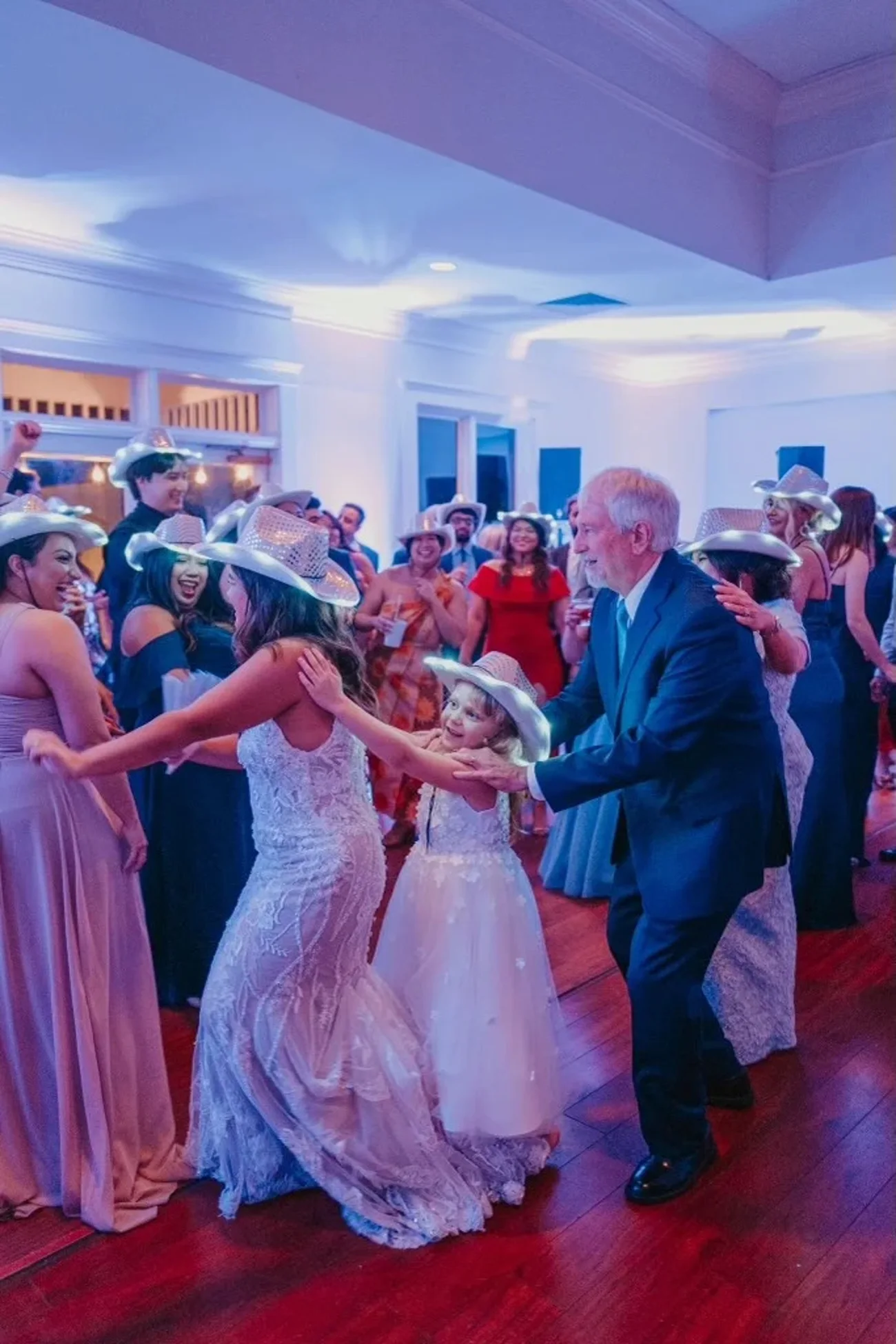
Some colors are basically foolproof on camera, and I steer couples toward them all the time. Warm amber is the champion — it reads like candlelight and makes almost any room feel cozy and expensive. Soft blush pink and deep romantic purple photograph beautifully too, giving that dreamy, editorial glow without ever looking harsh.
Cooler tones like a gentle blue or lavender also shoot well, especially later in the night when the dancing kicks off and you want that club energy in the frame. The key with any of these is intensity. A color at 60% brightness photographs far better than the same color blasted at full. Subtle almost always wins.
According to the lighting experts at WeddingWire, matching your uplighting to your palette is one of the simplest ways to tie a reception’s whole look together. Pick a hue that echoes your flowers or linens, keep it soft, and your photos will feel cohesive instead of random.
Uplighting isn’t the enemy of good photos. Bad uplighting is. Quality fixtures, soft intensity, and smart placement give a camera exactly what it wants.
The colors and setups that cause trouble
Now for the honest part — a few choices really can make photos harder, and I’d rather tell you straight. Intense, saturated red and deep green are the trickiest. They’re not off-limits, but they need a careful hand and plenty of balancing light, or skin can pick up a tint. If you love red, we just plan around it instead of drowning the room in it.
The bigger culprit is almost never the color at all. It’s the setup. Too few fixtures forced to work overtime, lights aimed at head height instead of up the walls, or a single bold color with no other light in the room — those are the real reasons a photo goes wrong. Fix the setup and the “problem colors” mostly stop being a problem.
This is also why cheap DIY uplighting kits from a big-box site can backfire. They’re often underpowered, so you compensate by cranking brightness, and that’s exactly what causes the wash-out. A room lit by a pro with enough quality fixtures never has to overdrive a single one.
Working with your photographer
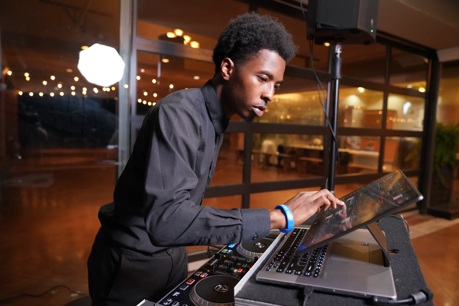
Here’s what a lot of couples miss: the best uplighting photos come from the DJ and the photographer being on the same page. When I set up a room, I want to know where your photographer plans to shoot the first dance, the toasts, and the big group moments — so my colors support their shots instead of fighting them.
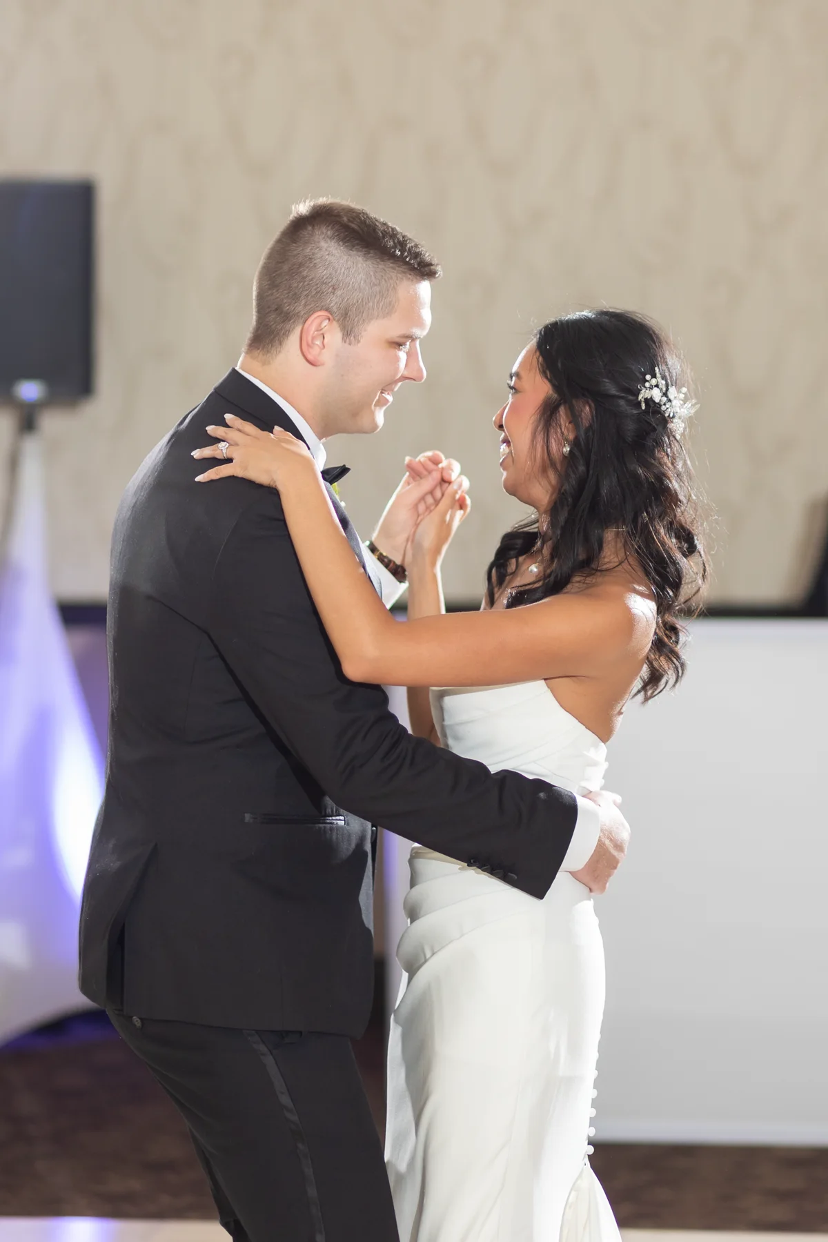
A good photographer bounces flash and controls their exposure to keep faces natural, and they’ll actually use the uplighting as a gorgeous background layer. Some of the most striking wedding shots out there have deep purple or amber walls glowing behind a couple lit by soft, clean light. That’s teamwork, not luck.
So if you’re booking both, tell them to talk before your day — or better yet, book a DJ who already thinks this way. I coordinate my room lighting design around the photography every time, because I want your reception to look as good in the album as it did in person. For more planning tips, check out the rest of our wedding blog whenever you like.
Placement: the real make-or-break
If you remember one thing from this whole post, make it this: placement matters more than color. Uplights belong at the base of the walls, angled up, so the light climbs the surface and fades softly. Aimed that way, they turn a plain Birmingham ballroom into something with real depth and mood — and they never blast a guest in the face.
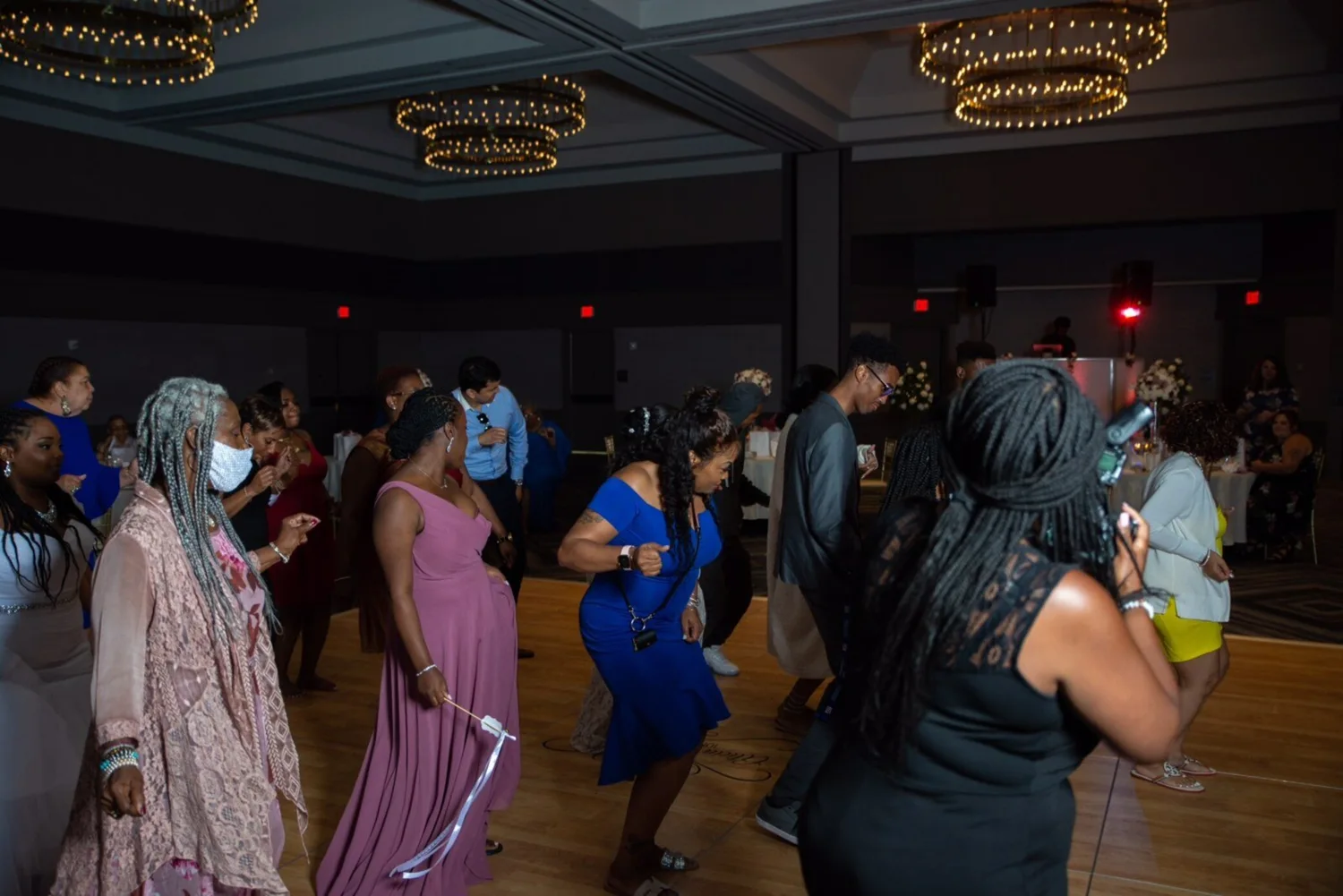
The number of fixtures matters just as much. A room with enough uplights, each running at a comfortable brightness, looks even and rich. A room with too few, each cranked to the max, looks patchy and harsh. It’s the same color either way; the difference is entirely in the setup. That’s why I map every room before your date instead of guessing on the night.
Spacing, height, angle, intensity — those four choices decide whether your photos glow or blotch. Get them right and the “does uplighting ruin photos” question answers itself. Your pictures come back looking intentional, warm, and unmistakably yours.
The honest bottom line
So, does uplighting ruin your wedding photos? No — not when a professional runs it. The disaster photos come from underpowered gear, too few fixtures, and light aimed at faces. Fix those, and uplighting becomes one of the biggest upgrades you can add to how your reception looks and feels, both in person and in the album.
My advice is simple. Skip the DIY kit, choose a color that echoes your palette, keep the intensity soft, and hire someone who coordinates the light with your photographer. Do that and you get the mood you’re after with none of the red-face regret. Birmingham couples do it all the time and love the results.
If you want a room that photographs beautifully and a dance floor that stays packed, that’s exactly what I do. Take a look at how I run a full reception in my Detroit wedding guide, and feel free to meet your DJ before you commit. Have a date in mind? Let’s check it while it’s still open.