Two-Tone Uplighting: Mixing Colors That Work
Picking one uplighting color is easy. Picking two that actually look good together? That’s where couples freeze up. But two-tone uplighting is one of the prettiest looks you can give a room — when the colors are chosen with a little care, they blend into something richer than either shade alone. The catch is that the wrong pair can turn your elegant reception into a spooky cave. Don’t worry, it’s simple once you know the rules. Here’s how to mix two hues that work for your Troy wedding.
In this article
Why go two-tone at all
First, why bother with two colors instead of one? Because a single flat color, while nice, can feel a little one-note across a big room. Adding a second tone gives the space depth — light and shadow, warm and cool — so the walls feel designed instead of just painted with light.
Two-tone uplighting also lets you match more of your palette. Most weddings have a main color and an accent. Putting both in the room ties your lighting to your flowers, your linens, and your whole look. Suddenly everything feels like it belongs together, which is exactly the polished vibe you’re after.
And it photographs beautifully. Two colors create gentle gradients on the walls that give your pictures dimension. A room lit in one shade can look flat in photos; a two-tone room has movement and richness that the camera loves. Color-planning tips from WeddingWire’s color guide can help you match your two tones to the rest of your palette.
The simple rules for pairing colors
Here’s the good news — you only need a couple of rules to get this right. Rule one: pair colors that sit near each other on the color wheel, or pick one bold color and one soft neutral to support it. Both approaches keep the room harmonious instead of jarring.
Rule two: mind the temperature. Warm colors (amber, blush, soft pink) feel cozy and flatter skin. Cool colors (blue, teal, purple) feel modern and moody. You can mix a warm and a cool, but let one lead and the other support — a fifty-fifty fight between hot and cold rarely lands.
Rule three: when in doubt, keep one of your two colors soft. A pair of two loud, saturated colors competes for attention. Pull one back to a gentle wash and the whole room reads elegant. Want to see these rules in real rooms? Our room color gallery shows a bunch of pairings side by side.
Color combos that always work
Let’s get specific, because examples beat theory. A few pairings almost never miss, and they’re a safe place to start.
Amber and soft pink is the crowd-pleaser — warm, romantic, and flattering on everyone. Blush and champagne gives a light, airy, elegant feel that suits a classic wedding. Deep blue and purple leans modern and dramatic, perfect for a couple who wants a moodier, late-night club energy on the floor.
Amber and deep red reads warm and luxe, gorgeous in a room with wood or gold accents. And teal and warm white feels fresh and coastal without being loud. According to The Knot’s uplighting guide, pairings that share an undertone — both warm or both cool — are the most reliable way to a room that looks intentional.
Two-tone lighting isn’t about using more color — it’s about giving the room depth so it feels designed, not just lit.
Pairs to avoid (and why)
Now the ones to skip. Some combos look great on a mood board and terrible on a wall, so learn from other people’s mistakes.
Red and green together read like a holiday, no matter the season — unless that’s your theme, steer clear. Bright green and blue can tint skin in unflattering ways and make everyone look a little seasick in photos. Any two ultra-saturated colors fighting at full strength turn a room heavy and dark instead of glowing.
Here’s what a lot of couples miss: uplighting reflects onto faces, not just walls. A color that looks cool on paint can do strange things to skin tone. That’s exactly why the safe pairings lean warm — amber and blush make people look radiant, while heavy greens and purples on their own can wash faces out. When you’re unsure, pick the pair that flatters your guests, not just the one that matches the invitations.
Key takeaway: Two-tone uplighting works when your colors share an undertone or when one bold color is balanced by one soft one. Keep at least one tone gentle, mind how light hits skin, and lean warm when in doubt. Amber-and-blush, blush-and-champagne, and blue-and-purple are reliable starting points.
Where to place each color
Color choice is half the job; placement is the other half. Where each tone lands changes the whole feel of the room, so it’s worth a plan.
A common approach: put your softer, warmer color on the walls where guests sit and mingle, so faces stay flattering all night. Then use your bolder accent color to frame the dance floor or highlight a feature wall — behind the head table, around a fireplace, or on a set of columns. That way the fun color pops where the energy is, and the flattering color stays where the people are.
You can also stack the two tones by alternating fixtures around the room for a gentle striped or gradient effect. It’s a subtle touch that makes a plain wall look custom. A good lighting person will walk your room and place each color where it does the most good — that’s the kind of eye a real setup brings that a rental kit never will.
Shifting colors through the night
Here’s a trick most couples don’t know: your two tones don’t have to stay fixed all evening. Modern uplights can change color on command, so your DJ can shift the room to match each part of the night.
Picture it. Soft amber and blush during dinner, warm and romantic while people eat and toast. Then, as the floor opens, one color deepens into a richer blue or purple to bring the party energy up. Same two-color family, just dialed to the moment. The room grows with the night instead of sitting still.
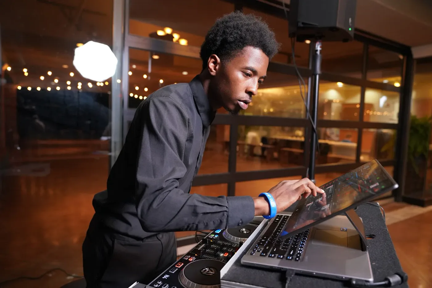
That’s the real advantage of one team running both music and light — the color follows the mood of the songs. When I DJ, I treat the walls like another instrument, shifting them as the night builds. If you want the full picture of how sound and color come together, my Troy wedding guide covers the whole flow, and you can browse more lighting tips anytime.
Choosing your two tones in Troy
So how do you land your pair for a real Troy wedding? Start with your palette. Pull your main color and your accent from your flowers or invitations, then check them against the rules above — shared undertone, one soft, both kind to skin. Nine times out of ten, that gives you a winning pair right away.
Next, think about your room. A bright, modern space near the Somerset Collection area handles cooler tones well, while a warm, wood-trimmed hall glows with ambers and blush. Tell your DJ your colors and your venue, and the placement falls into place. If you’re torn between two pairs, pick the one that flatters your guests in photos — you’ll be looking at those pictures for decades.
At the end of it, two-tone uplighting is just a small choice that makes a big difference. Pick colors that get along, keep one gentle, and let them shift with the night. If you’d like help choosing your two tones, you can meet your DJ and we’ll match them to your room and your palette. The right pair turns four plain walls into the prettiest part of the party.